JCN Law & Co. is an established legal firm based in Iloilo. The project involved a complete visual overhaul, transitioning from a literal, dated identity to a modern, geometric brand system that communicates Innovation and Precision.
The firm's original identity suffered from several "UX" issues in branding:
Visual Noise: The logo relied on literal "scales of justice" clip-art that lacked unique ownership.
Dated Aesthetics: A primary red-and-blue color scheme made the firm appear generic rather than high-tier.
Inconsistency: The brand lacked a structured system, making it difficult to scale across digital and physical touchpoints.
I identified two primary user segments to ensure the brand spoke the right language:
Corporate Entities & SMEs: Business owners in Iloilo seeking high-stakes legal protection. They value stability, precision, and efficiency.
Private Clients: Individuals looking for trustworthy, standard-setting counsel for property and notary services.
Through an audit of local law firms, I found that most used literal and busy branding. My research led to three key insights:
Trust over Tradition: While tradition matters, modern clients gravitate toward firms that look organized and tech-savvy.
Clarity as a Service: The law is complex; the brand should feel like the solution, not part of the confusion.
Local Prestige: To compete with Manila-based firms, the identity needed to feel "International" while remaining rooted in its Iloilo identity
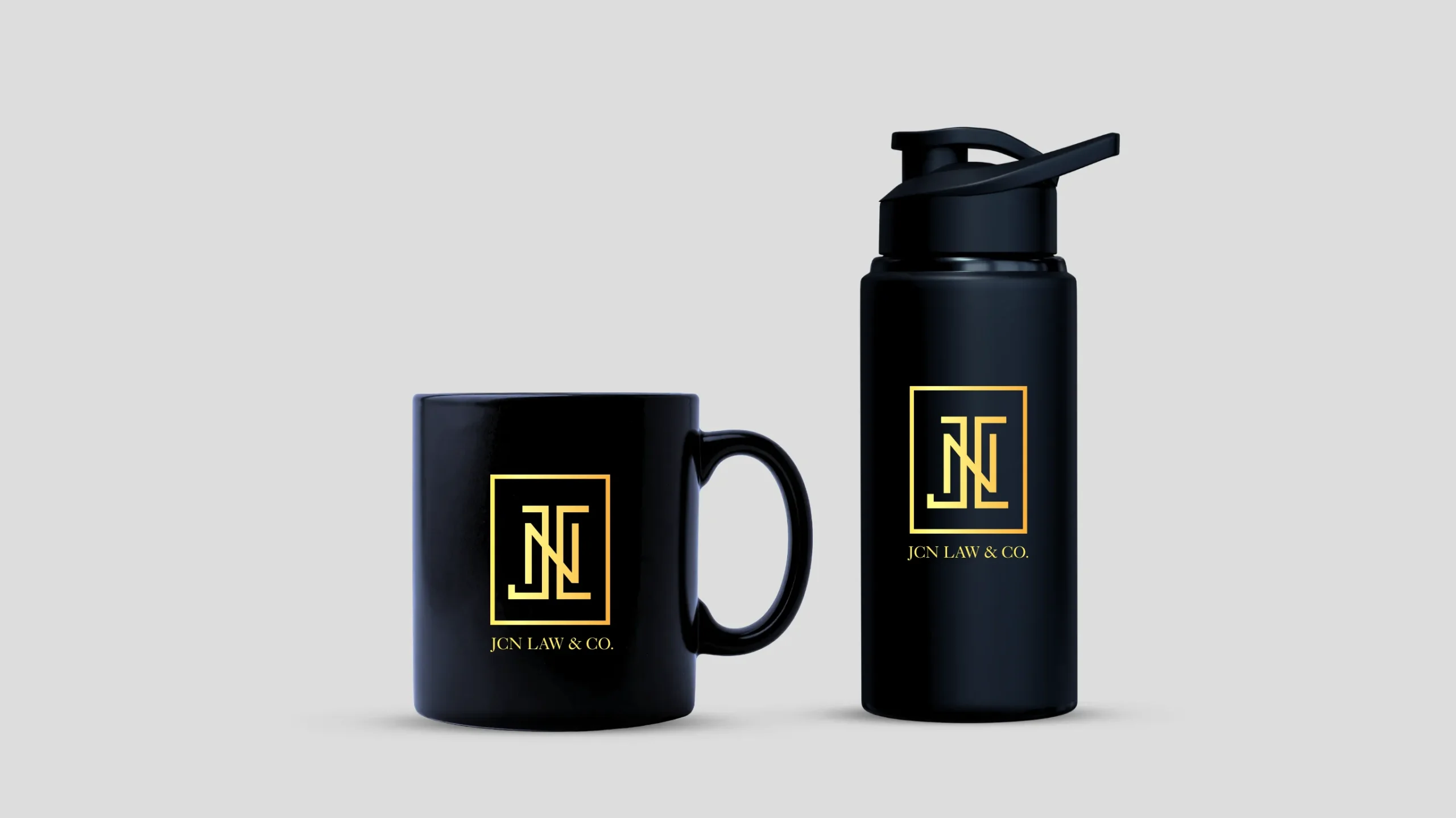
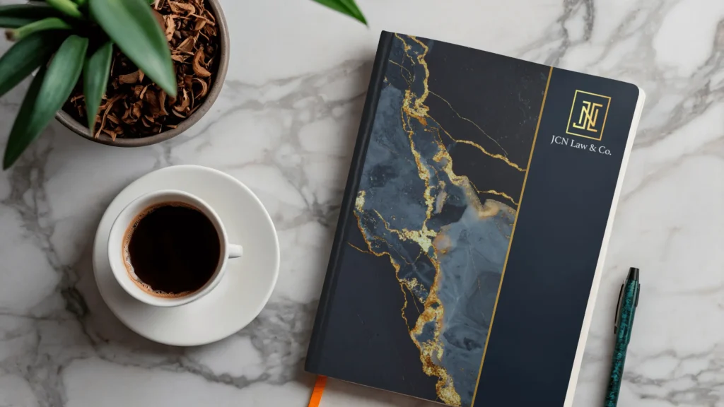
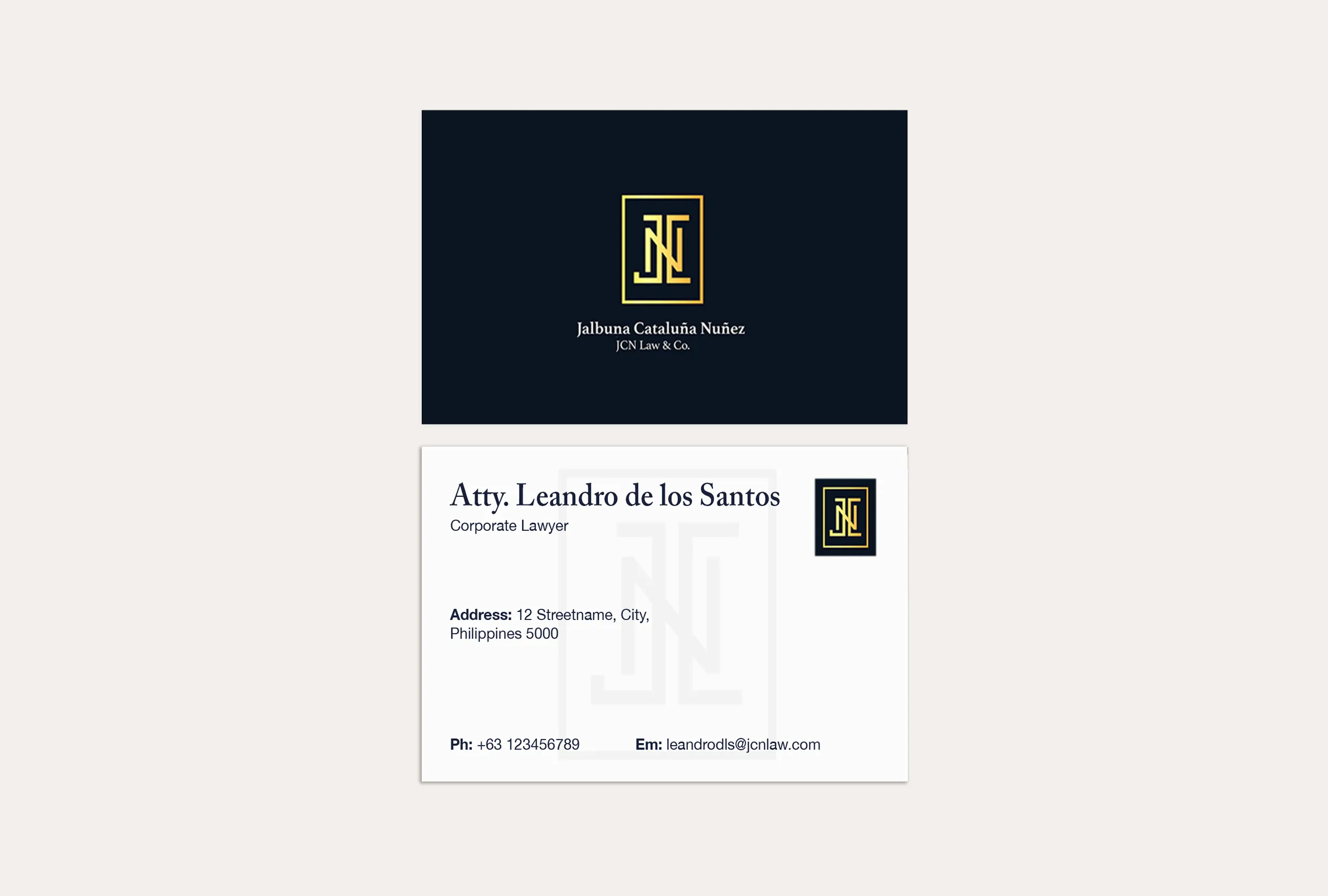
I designed a geometric monogram consisting of interlocking "JCN" initials within a square frame. The clean, sharp lines evoke modernity and structure. The simplicity of the form directly translates to clarity and managed complexity. This logo perfectly embodies innovation and results-driven counsel. The structured, precise geometry visually represents "clarity to the chaos," showing a methodical approach to solving complex problems.
I established a palette that commands authority: Oxford navy for stability, trust, and professional depth, and mustard gold for excellence and a contemporary edge that differentiates the firm from competitors.
A brand is more than a logo. I developed a system that ensures consistency across all user touchpoints.
Typography: Transitioned to high-contrast serif for a classic yet modern feel.
Variations: Created vertical, horizontal, and icon-only versions to ensure the brand works perfectly on a mobile app header or a physical office sign.
The result is a Results-Driven identity that builds clear, structured pathways for business goals. The new brand doesn't just look better; it changes how clients perceive the firm's value and intelligence before they even step into the office.