S-PaSS: Bridging the Gap in Digital Travel Logistics
S-PaSS is the primary travel management system for the Philippines. My task was to redesign the interface to handle high-traffic volume while ensuring a seamless experience across all device types.
The Strategy: Lean Systematization
Quality through Standardization.
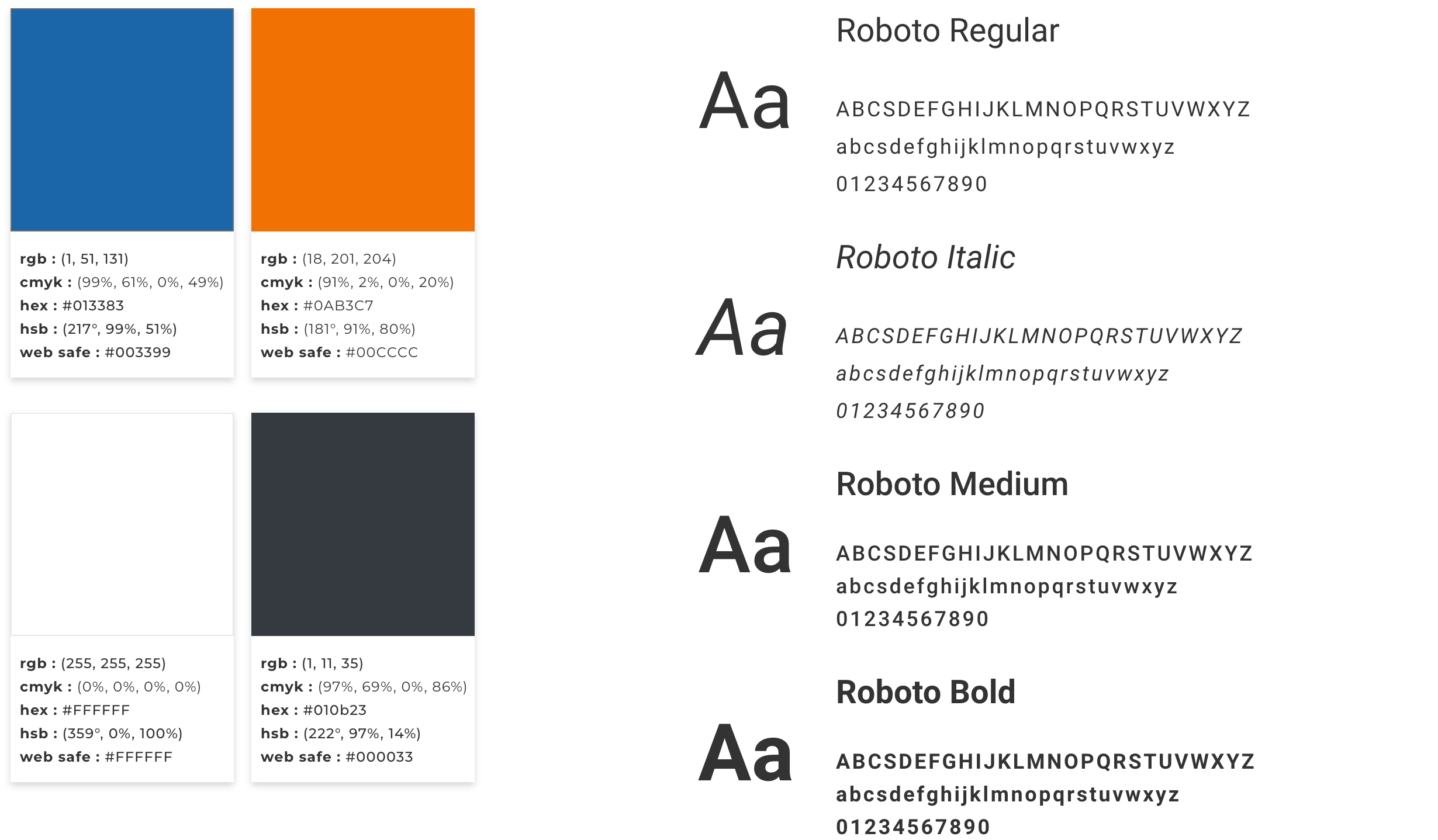
When budgets are tight, bespoke design is a luxury. High-quality UI was achieved by leaning into Atomic Design. By building a single, robust UI Kit first, the need for repetitive design cycles was eliminated. This ensured that even with a 14-day delivery, the visual polish remained consistent across hundreds of potential screens.
The Deadline: Radical Prioritization
Efficiency over Exploration.
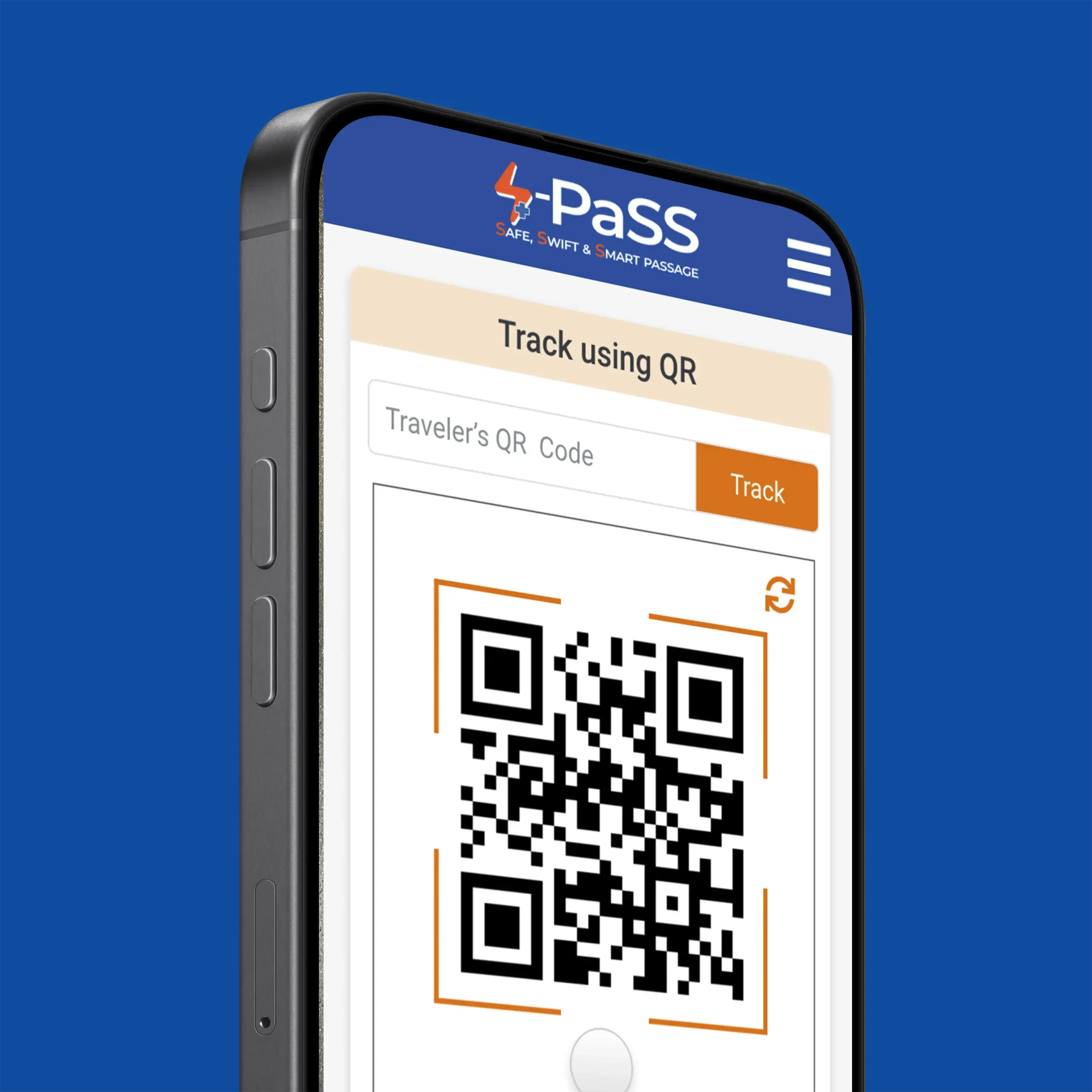
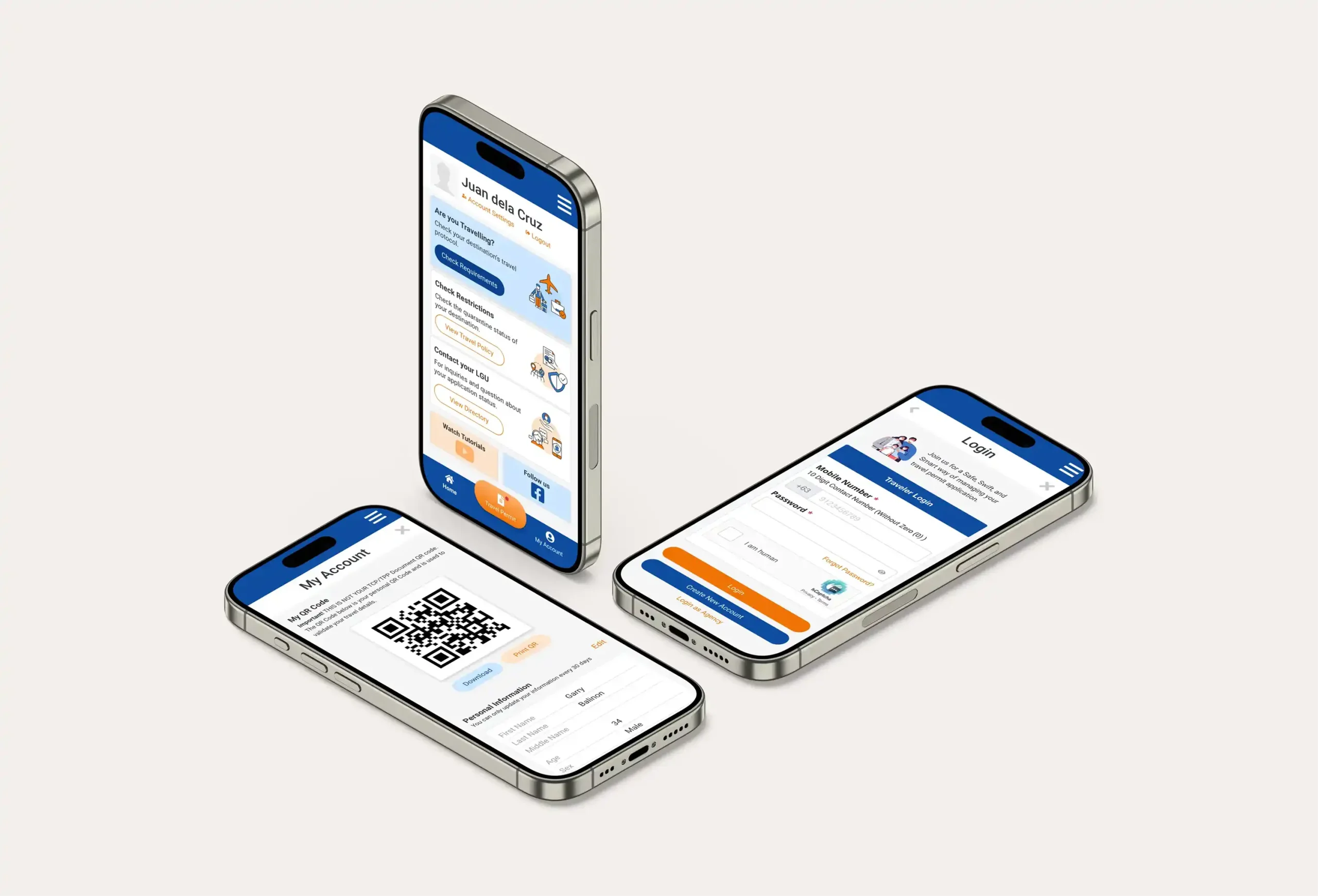
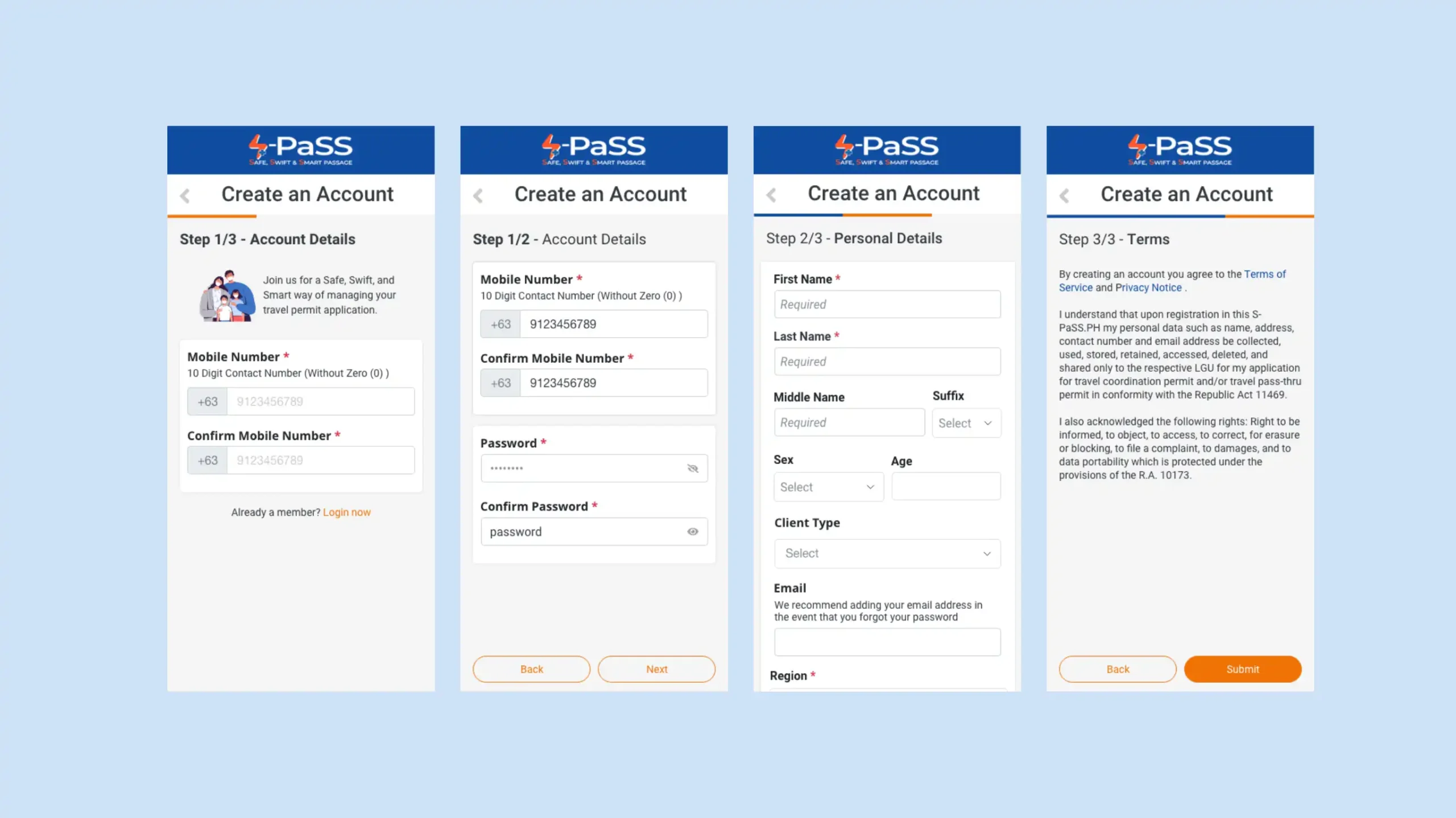
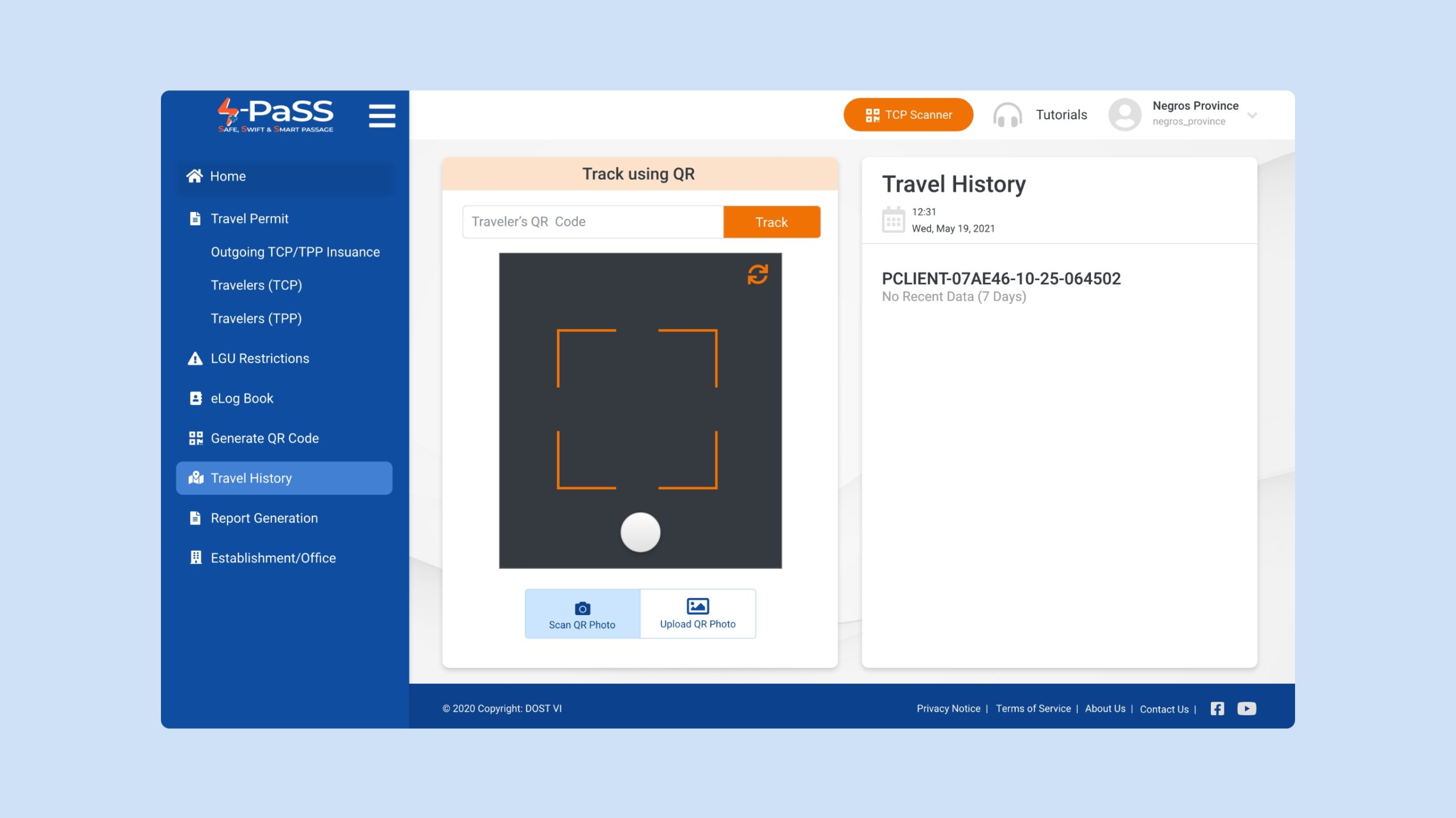
A 1-month roadmap compressed into 14 days leaves no room for “nice-to-have” features. The focus shifted to Core User Flows: Registration, Permit Approval, and QR Generation.
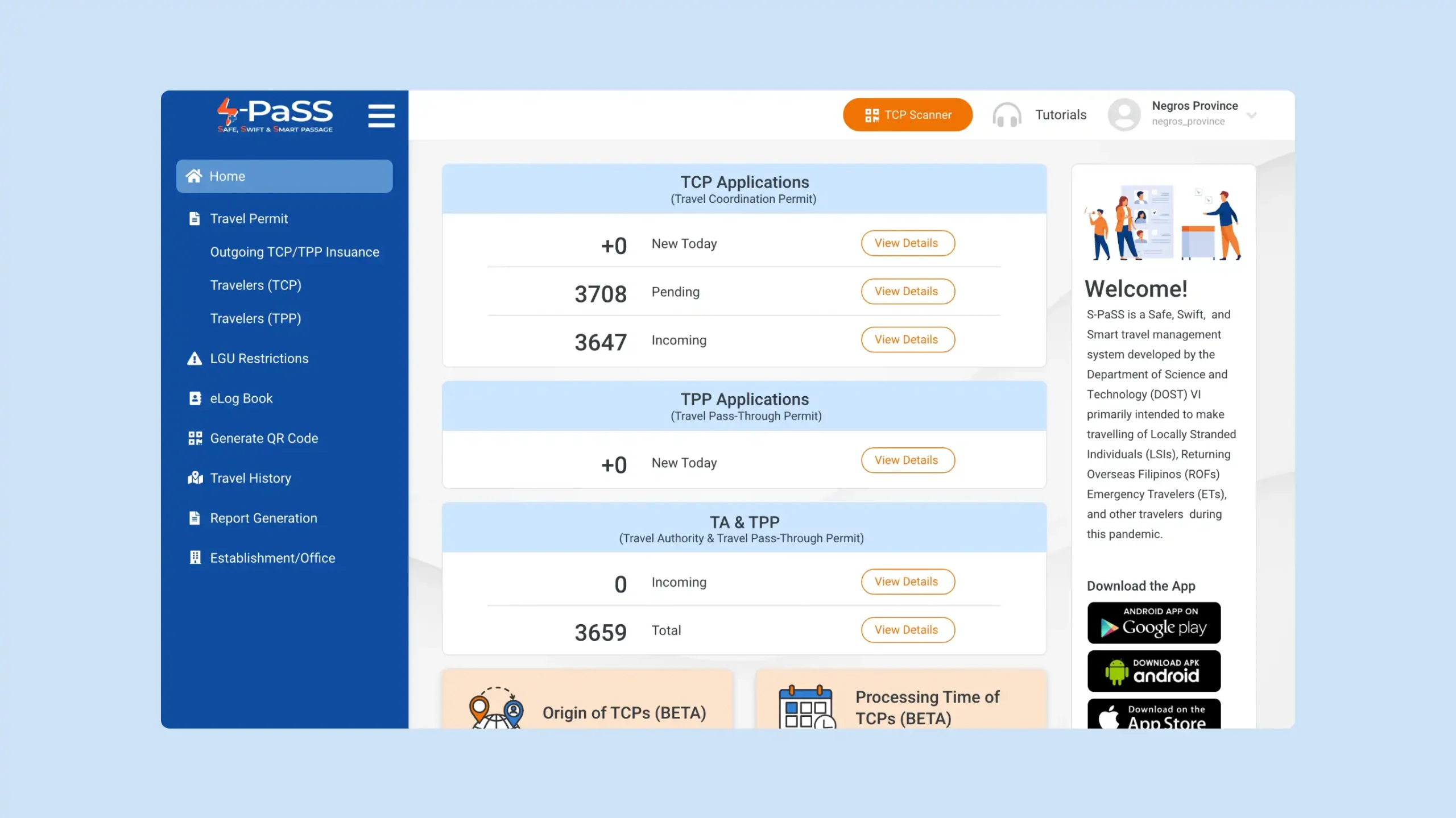
The 80/20 Rule: 80% of the impact comes from 20% of the features. Travelers go through a checkpoint scan and are then approved by the Authorities, the project delivered maximum utility in half the time.
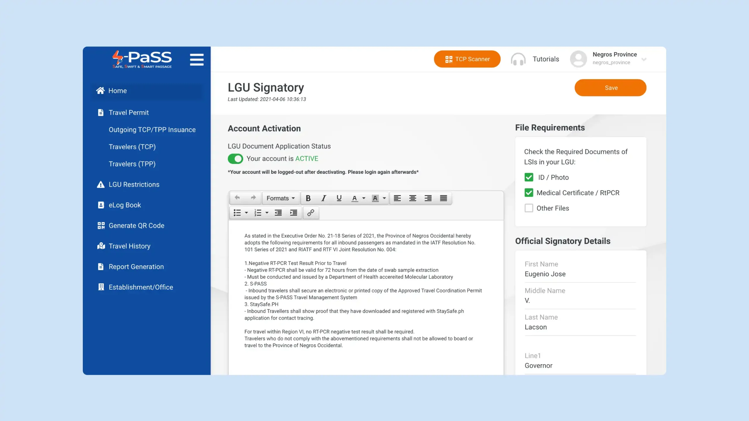
Parallel Workflows: Using a responsive standard allowed for the simultaneous design of mobile and desktop views, bypassing the traditional waterfall method.
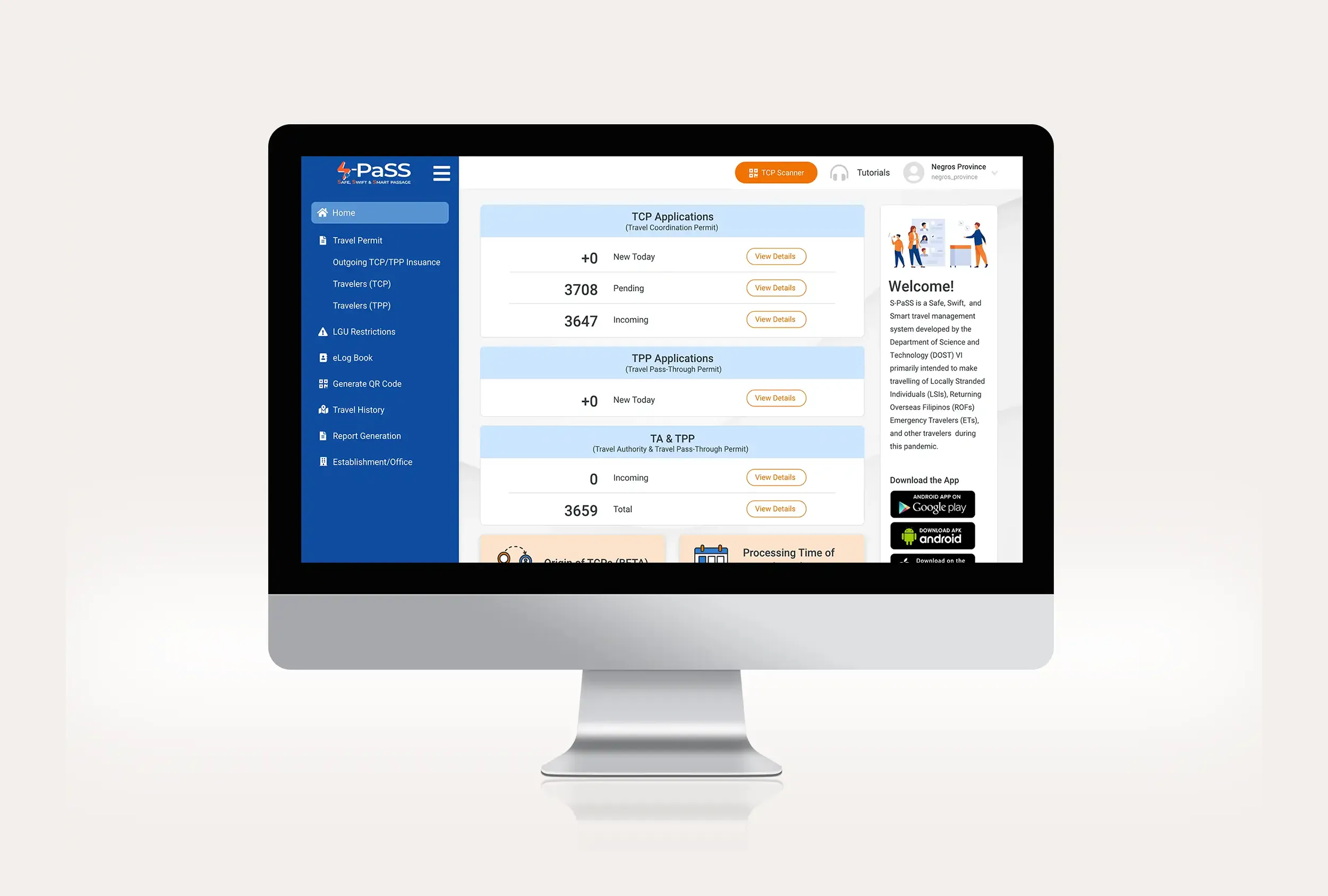
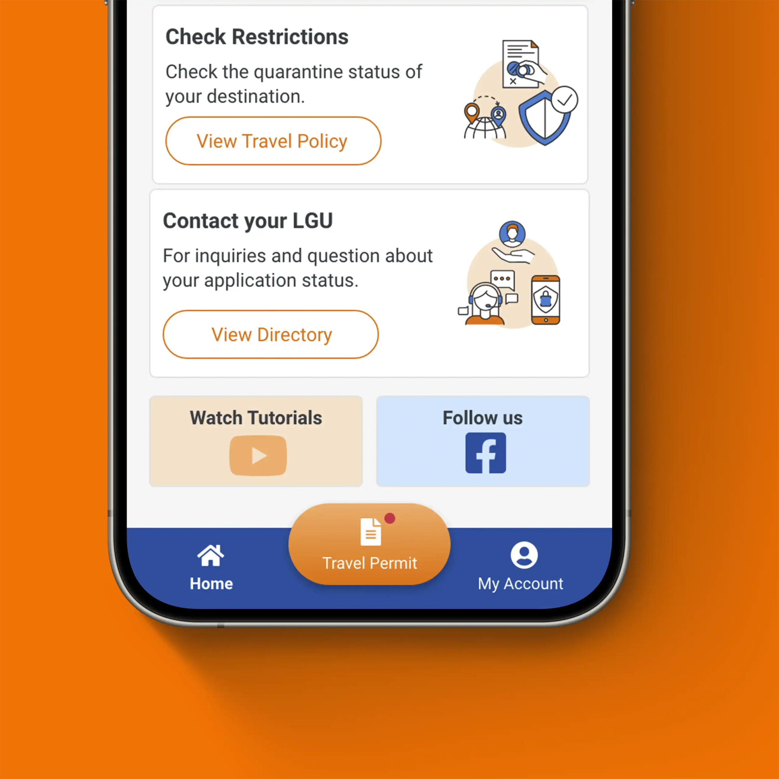
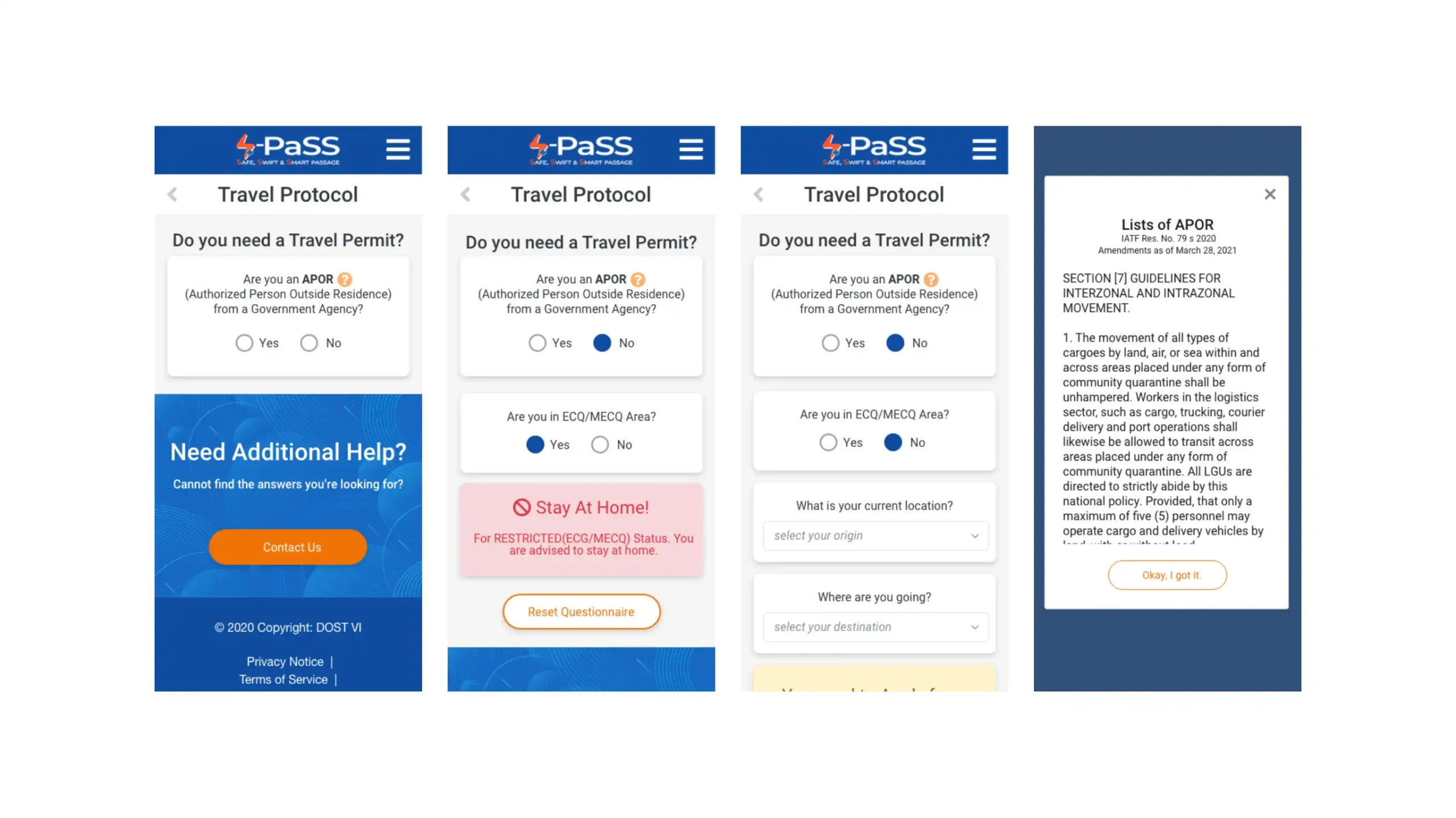
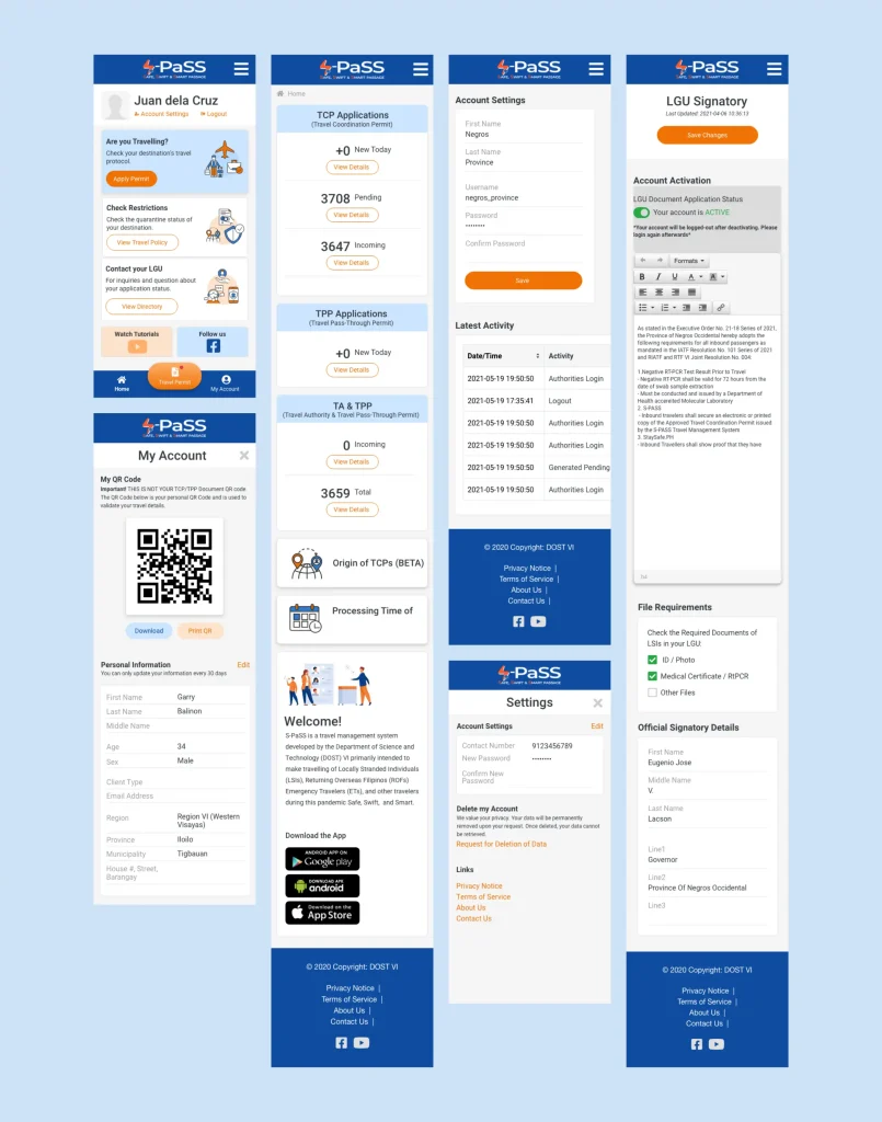
Mobile Registration and Travel Permit Inquiry
The Budget: Inclusive Design
High-End Performance on Low-End Tech.
Tight funds meant the system had to be accessible without expensive third-party integrations or heavy assets.
The UX Bit: Friction Reduction
Visual Clarity as a Functional Requirement. In a crisis, “High Quality” isn’t about decoration; it’s about Cognitive Load.
Typography: Strategic hierarchy directed the eye to the most critical data: “Approved” or “Denied.”
Touch Targets: Buttons were sized for “High-Stress Accuracy”—ensuring a traveler at a busy terminal or an admin on a tablet could navigate without error.